LadyBugHoney: Premium E-Commerce Design with a Cleaner, Stronger Brand Feel
LadyBugHoney needed a more premium, more polished online presentation with stronger branding, cleaner navigation, and a more trustworthy shopping experience.
What changed
Before
The site felt less premium than the brand deserved, with a layout that didn't fully show off the products or build trust on first visit. Navigation and product browsing felt basic.
After
The site now has a more polished, premium feel with cleaner navigation and a layout built to highlight the products and brand story. The shopping experience feels more trustworthy on both desktop and mobile.
Challenge, solution, result
Challenge
- Make the brand feel more premium and more legitimate on first impression
- Improve homepage structure and browsing flow
- Support product discovery and stronger visual trust
Solution
- Built a cleaner, more polished front-end direction
- Improved category flow and homepage hierarchy
- Focused on luxury feel, mobile clarity, and better product presentation
Result
- Stronger visual trust
- Cleaner shopping experience
- Better foundation for SEO and future growth
Why this matters for SEO
Case study pages add proof, support internal linking, help service pages feel more credible, and give the site more depth than a basic brochure layout.
Speed proof
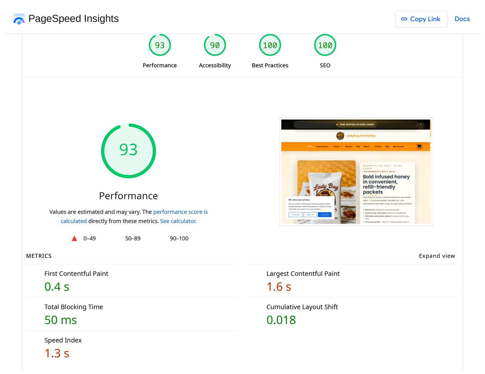
This is the actual PageSpeed Insights report for LadyBugHoney.com: 93 performance, 90 accessibility, 100 best practices, and 100 SEO. Scores move around a little between test runs, but they show the store loads fast and was built with care.
Related proof, service, and local pages
Want a similar upgrade for your ecommerce or brand site, with cleaner design and a better mobile shopping experience? Get a quote and we can talk through your site.